Curtain up for the new UI
![]()
In April of last year, we announced the gradual renewal of the timr web application’s design. The first steps have already been successfully implemented. We are now pleased to announce the next and most important step of the UI renewal. Before we go live we are providing the new UI as public beta. You now have the possibility to test the modernized design beforehand.
Milestone 3 of the UI renewal is focused on the Recording and Reports menu. Our main goal was to make the transition from the old to the new UI sleek and easy. The focus therefore was mainly on the design itself and on optimizing technical basics. For you switching to the new UI will take no effort at all.
The new changes give the timr web application a modern design. However, above all it is also the basis for implementing future improvements more efficiently.
The changes are summarized in a short video
The changes in detail
The new timr UI brings design changes as well as a few feature enhancements. We have listed the most important changes here.
1. New menu navigation
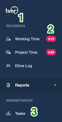
The menu navigation has been adjusted by the following:
- The recording pages are now permanently displayed in the menu bar, so you can navigate there with one click, no matter where you are.
- From now on you can also see the status of your time tracking at any time. Special badges show you whether work time recording or project time recording is currently running and how long the time recording is already running. This way you can see at a glance if you have forgotten to start your time tracking.
- The Task Admin menu now appears directly in the main menu bar.
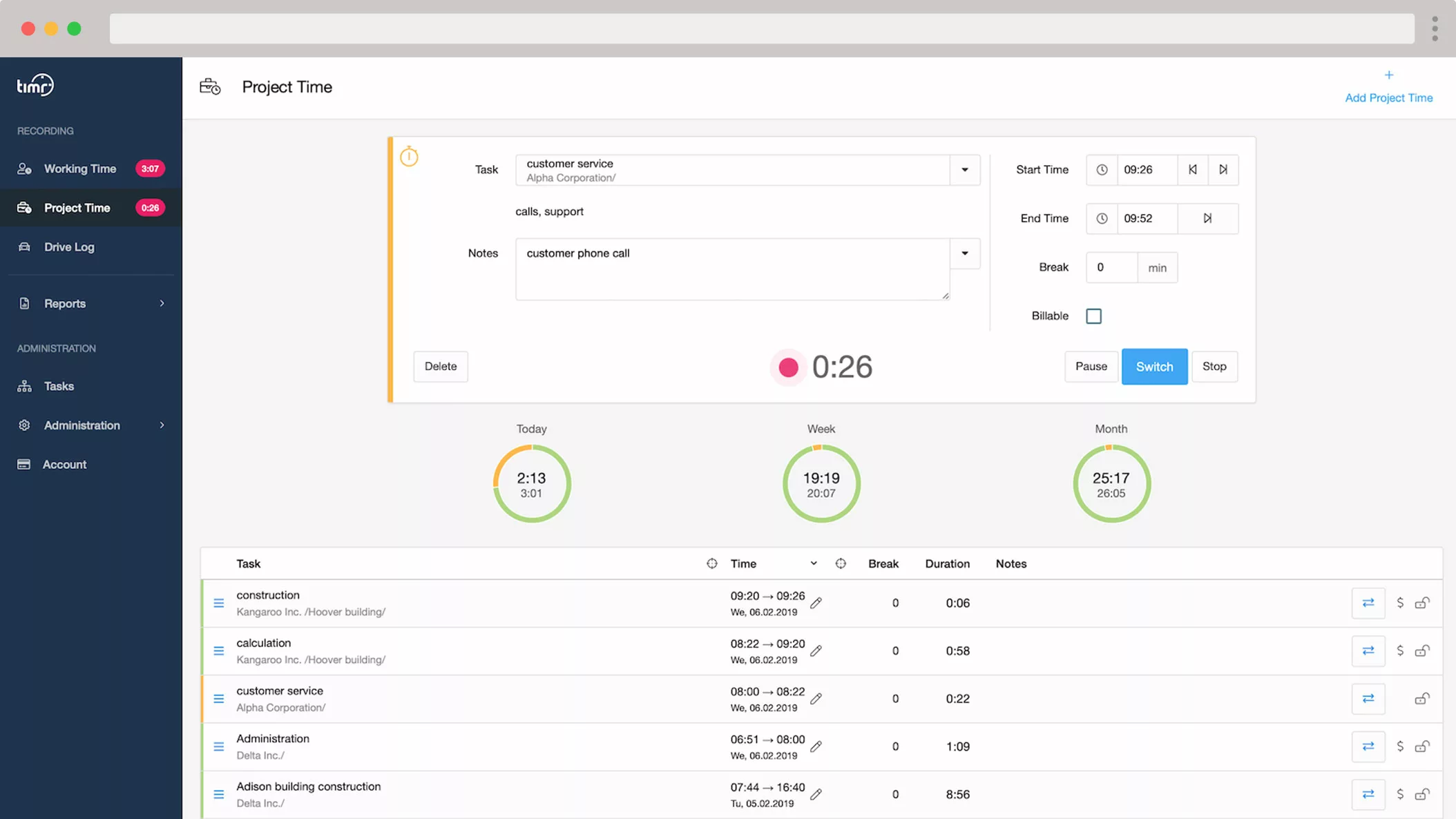
2. Design changes
The new Recording …
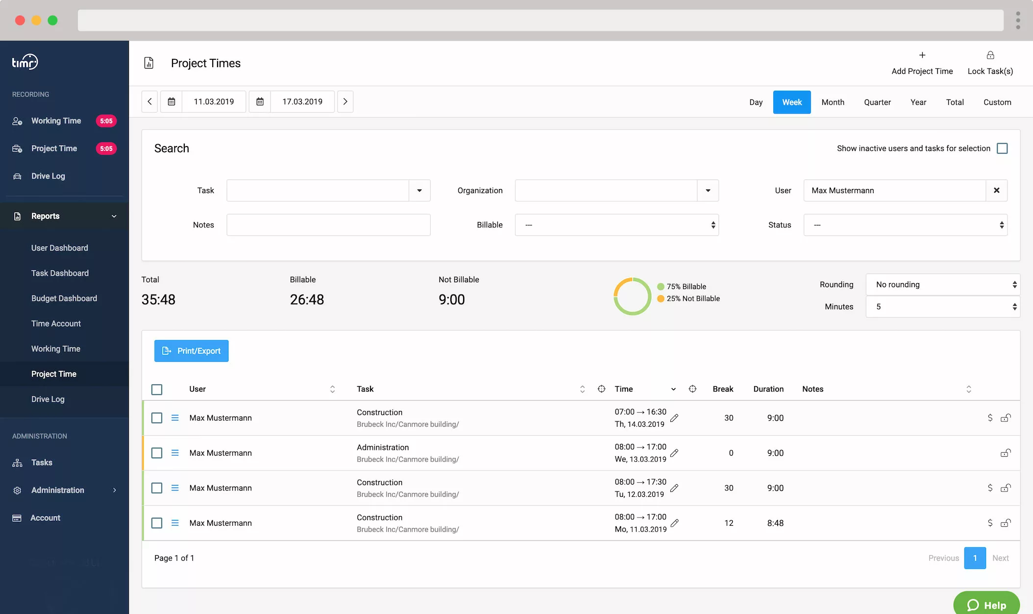
… and Reports:
!!! Important notes to the new UI
The icons in timr have generally been improved and are now being used more consistently. Here are 2 examples:
- If the time has been changed for an entry, this is now easier to see because the pen icon is now displayed directly next to the time and date of the entry.
- Entries with the status “Changeable” now have their own icon, which is permanently visible.
Also in the “Time account” the buttons for “Balance period”, “Correct work balance” and “Correct vacation” are now on the top right.
3. New features
Like mentioned above our main goal was to make the transition from the old to the new UI as easy as possible for you. Therefore, above all we focused on the design. However, we couldn’t resist making some feature improvements as well. Understand it as a sneak peak on future improvements.
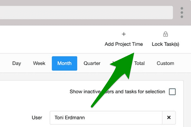
3.1. Add time entries
For adding time entries manually timr provides the “Add time”/”Add Project time” option which has been specifically designed for this use case. If you use working time tracking this feature also allows you to enter holidays or sick leave
Until now many have used the Start-Stop Timer to add time, also for time entries of past days. However, to further optimize the Start-Stop Timer, the new UI has removed the date picker. The Timer is so clearer and faster to use. Thus, it is now only possible to add times via the Add button on the top right.
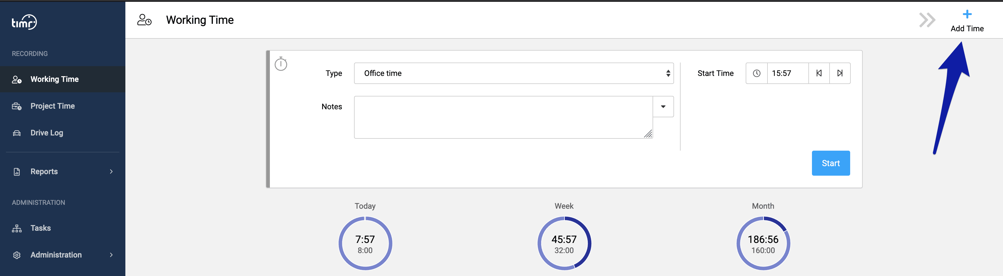
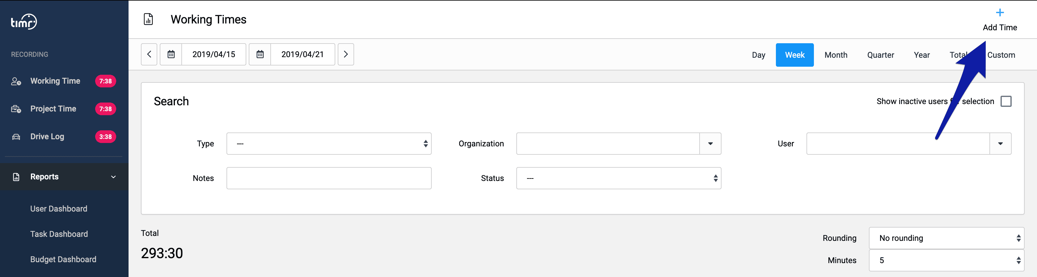
In the Reports menu the “Add time” button can now also be found on the top right side.
3.2. Optimized task search
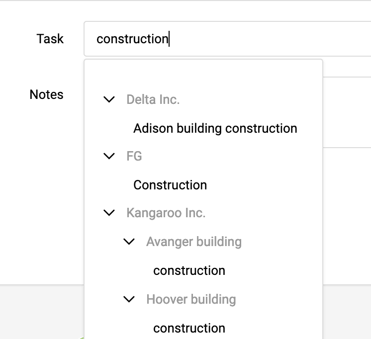
The task search has been optimized and expanded. Now you can also include higher levels of your task structure in the search. Specifically, this means that you can, for example, also include the customer name in the search.
Until now
If you previously wanted to start tracking for the task “construction” for a particular customer, you entered “construction” in the search and all related tasks were displayed.
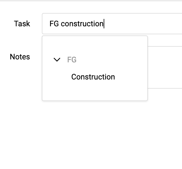
From now on
Now it is possible to search for “FG construction”, for example. This will only display this task. In the timr apps, this option has existed for some time.
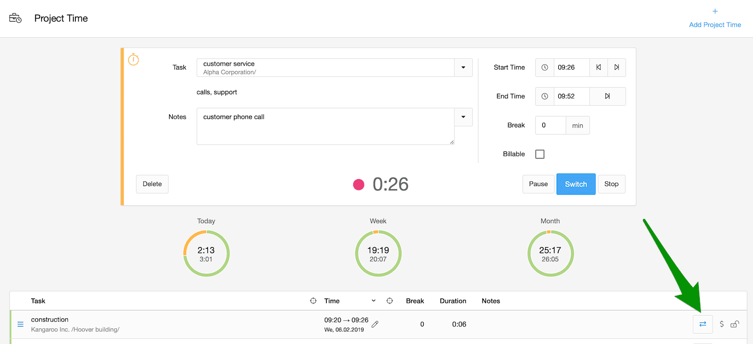
3.3. Switch tasks even faster than now
Changing tasks is even faster than before. If, for example, you were only interrupted by a short call and then want to switch back to the previous task, this is now possible with one click. To do this, click on the “Quick switch” button for the relevant task in the list of all time entries directly below the timer. The time for the previous task is thus immediately stopped and automatically started for the new task. Notes are simply taken over.
Future improvements
The changes to the timr UI that are made with this update are the most important step in the entire renewal process so far. The biggest change has thus been made. In the future, the renewal of the areas “Administration” and “Tasks” will follow in 2 further steps.
