timr has a new look
As a visible sign of our investments in timr over the past few years, as well as the numerous innovations planned or already in the works for the future, we have also invested in an updated and consistent corporate design.
In the course of the corporate design renewal, we gave timr a little makeover. With this, we modernized and refreshed the user interface of the web application and the timr apps from version 10.
Design is of course a matter of taste but we hope you like it and that it makes your daily work with timr even more pleasant!
What specifically is changing?
In short: The functionality and handling in timr remains completely the same, timr is from now on only a bit nicer to look at 🙂

New logo
With a new corporate design, of course, a new logo must not be missing.
![]()
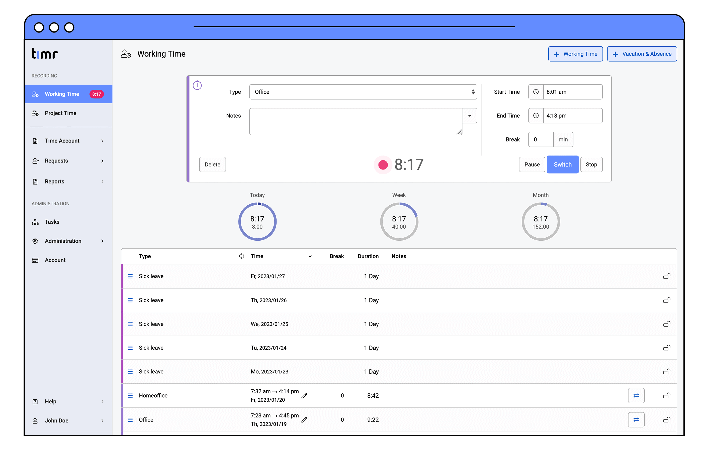
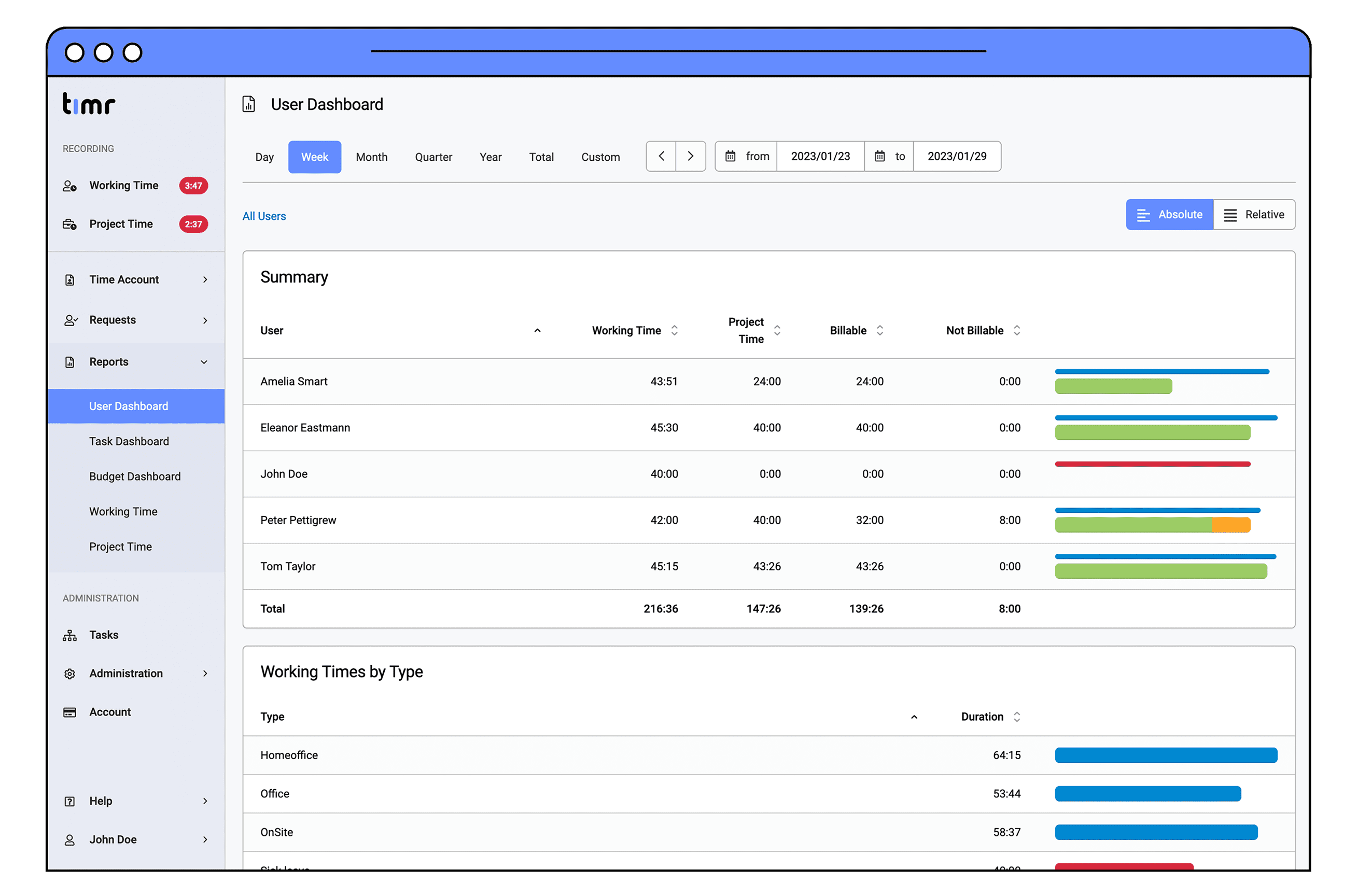
Web application
In order to maintain continuity in the daily work, we have been very careful with the design adjustments.
The redesign is limited purely to the colors used. The old, but somewhat dark timr blue is history. From now on we work with new lighter colors. Especially the menu bar will be brighter and friendlier.
Apart from that, everything has remained the same, as you can see here. All functions are in their usual place.
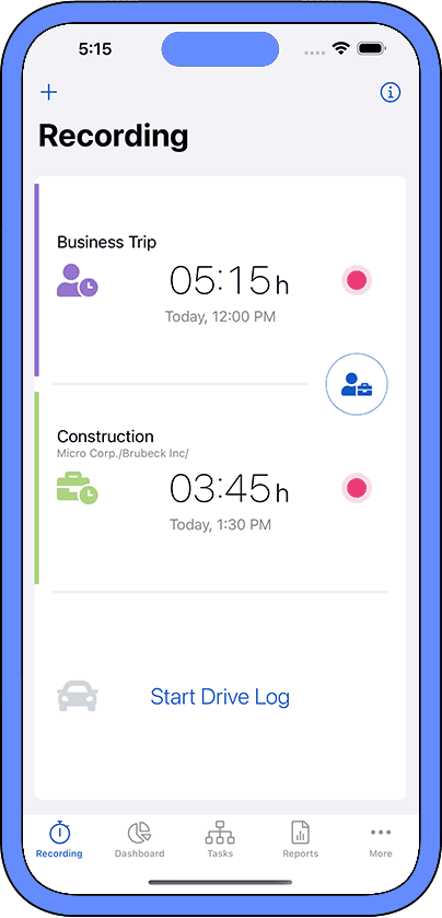
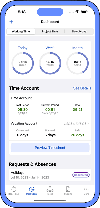
Mobile Apps
The most important design change regarding the app is the new app icon in the new colors.
![]()
Apart from that, the app now presents itself in a fresh and modern design.
Here, too, as with the web application, we have paid attention to continuity and have not changed the structure of the app, so that all functions are in the usual place.